Consolidating the Menu & Reorganizing the Site Pages
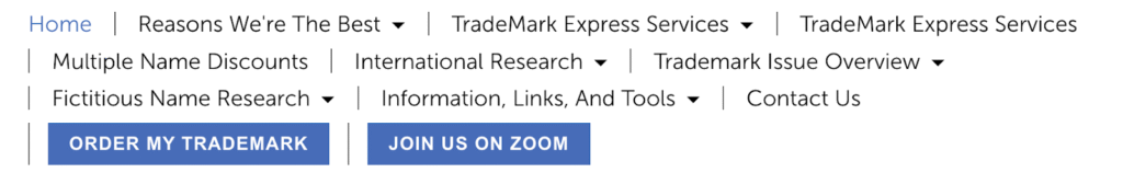
The old header menu consisted of 10 navigation links, some with multiple sub-categories, and two buttons.
The website is chock full of information about trademarks & the TradeMark Express process but the company needed a cleaner navigation menu that would lead their clients to the right information. Sagebright cut the links in half, down to a clean 5: Home, About, Services, FAQs, & Contact Us. From there, we focused the sub-categories to their bread-and-butter, their trademark Services.

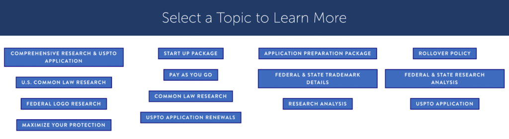
Next up was consolidating the pages into a more cohesive whole to make it simpler for clients to navigate. The old Services page had a mega-menu linking users to different sections on the main page but the CEO did not care for the layout or the order of items.
The company felt this was too confusing for their clients as it was not clear where they should look first or next. This topic mega-menu was also halfway down the page.
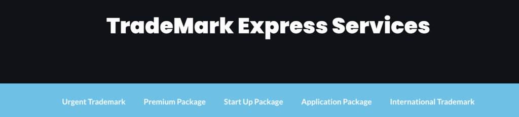
Sagebright moved the primary subjects to the front page of Services and focused the navigation menu on action-based items, i.e., describing TradeMark Express’ suite of services.
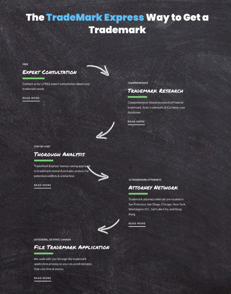
Redesigning the Home Page
Similar to the menu navigation issues, the CEO felt the home page didn’t lead their clients along a logical route. The old home page had a 5-block series describing the TradeMark Express process but, again, it didn’t necessarily lead the user from one step to the next.
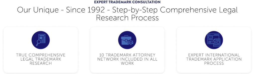
The client wanted a ‘chalkboard’ look for the redesign of this section and then beyond that, looked to Sagebright for design ideas. Understanding that the client wanted to provide important details but to do so in an orderly manner, we opted for a relaxed flowchart design.